Enhance what's there. Remove what's not the focus.
Color-grading is an art built on a set of principles driven by color theory. Theoretically speaking, it's a good idea to start enhancing colors that are already there, and use color theory principles as your starting point and then move forward.
- Nail the exposure: With good exposure and proper lighting conditions, it will be much easier to color grade your video.
- Enhance colors and contrast levels for emotional impact: Enhance the primary colors to draw interest to areas of the footage that convey the implicit connections you want the viewer to feel. (Sunrise, Ocean, Inspiring, Fitness Workout, Emotional).
- Connecting to Emotion: Color-grading helps tell the emotional connection of whats happening to characters, and how important it is. Which overall add's to the implicit story telling thats unfolding in the video.
- Too much is too much: Going against the grain of your footage by adding in colors that are not in your video or over-saturating colors can give the effect that the video is surreal and could distract the viewer from what's happening in the frame.
Grade to the composition
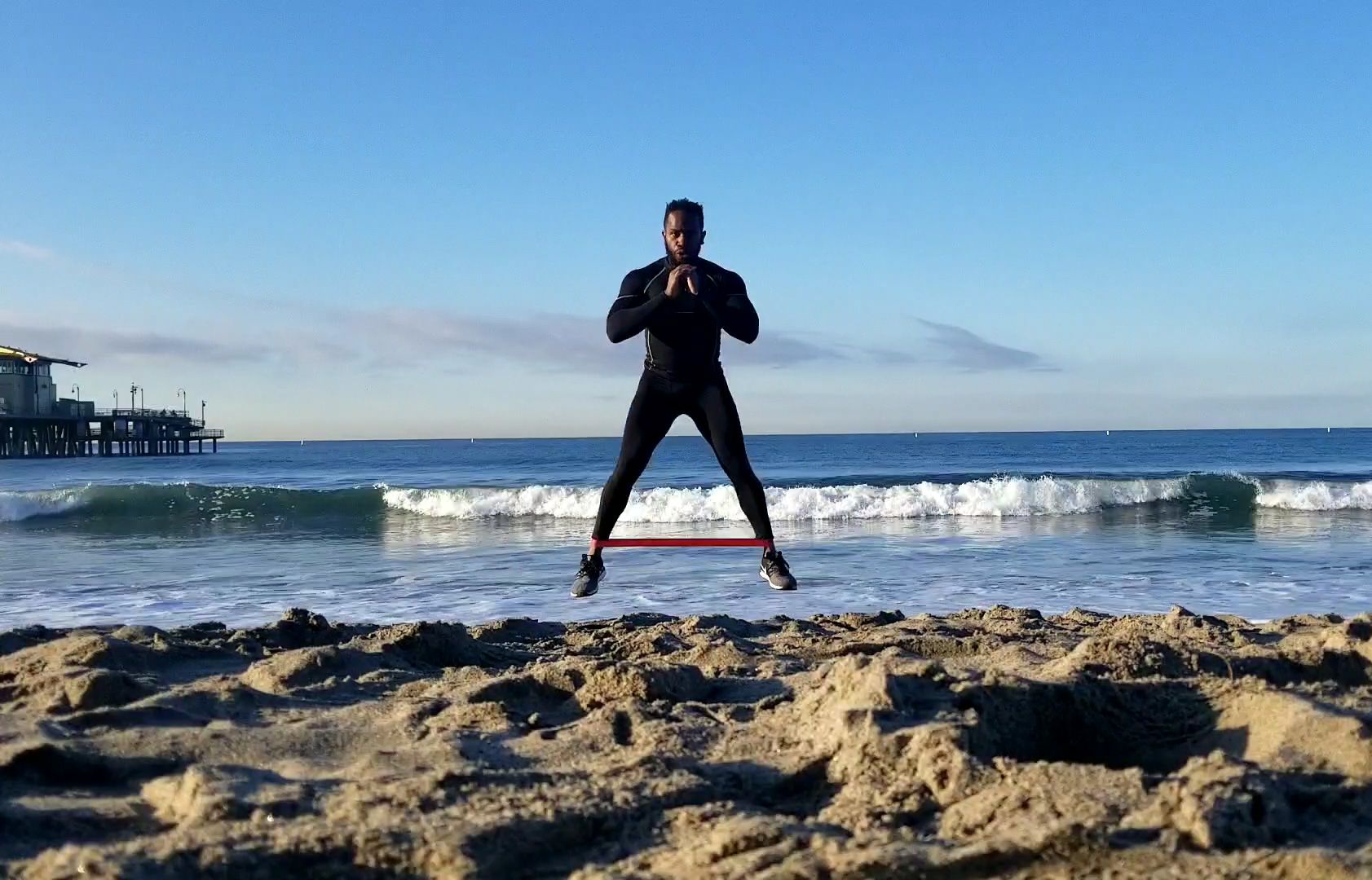
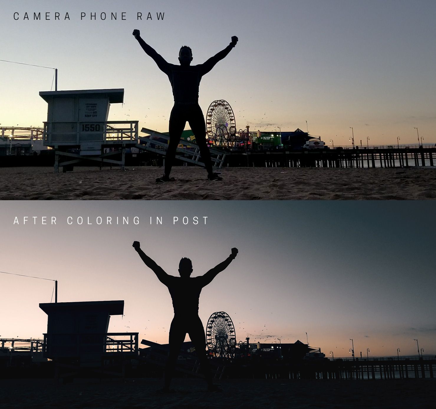
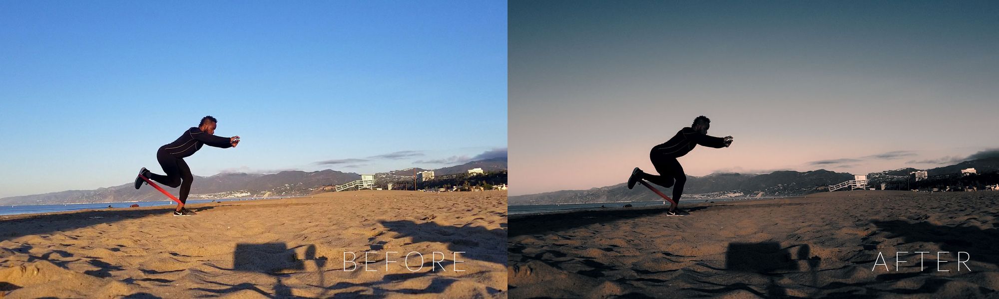
We will use the Harris Martin Fitness project as an example. The video starts on the beach with Harris straddling the infinity horizon with his bodysuit casting a black silhouette of his muscular physique. I wanted to give the viewer the feeling of how hard Harris works and how early he gets up to hone is craft for fitness.
The sunrise fueled these implied emotions within the dramatic orange highlights and cool blue shadows. The sun was just at the top of golden hour and I chose to enhance those warm tones to create a strong dramatic cinematic feel. By focusing on complementary colors of Orange / Blue, I lowered a few colors such as Red and Green, and moved Yellow to be more Orange in the highlights, as well as adding more Blue into the shadows and mid-tones.
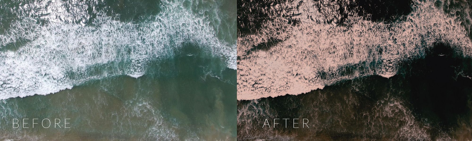
Color-grade Examples
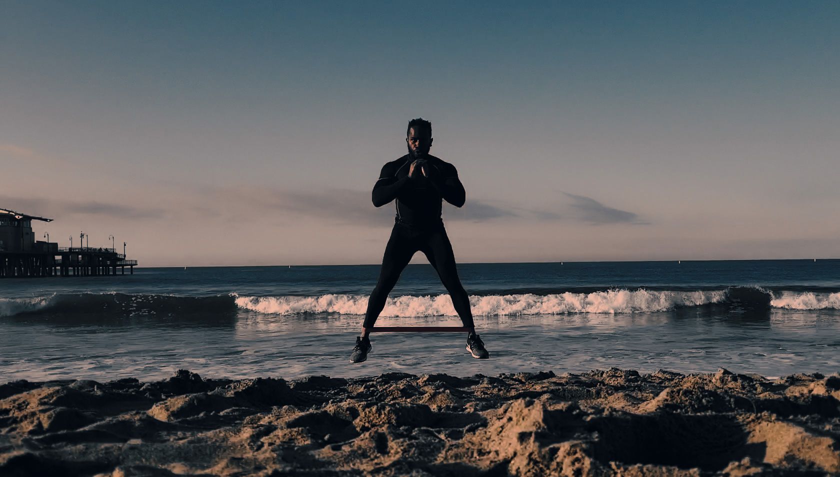
As you can see from a few shots in the sequence, each example shot has that Orange and Blue color-grade as the focus. After that, I made the footage even more dramatic by crushing the Blacks/shadows, and adjusting the highlights to to be more saturated.
The result of the video proved highly engaging on social media for our client Harris Martin.
Comments